

Freelance Work
Client: DICK’s Sporting Goods
From celebration towels to digital assets and guidebooks, I design tools that help DICK’S Sporting Goods engage and inspire teams around DEI-centered events.
Tailgate Guide
A spirited, practical guide for DICK’S Sporting Goods teams to confidently plan and celebrate DEI events.
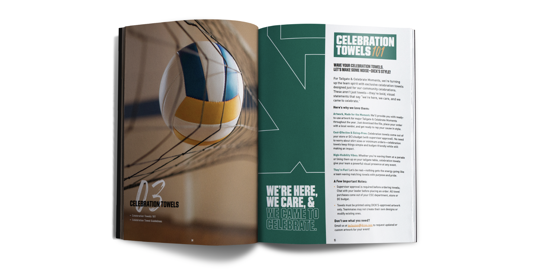
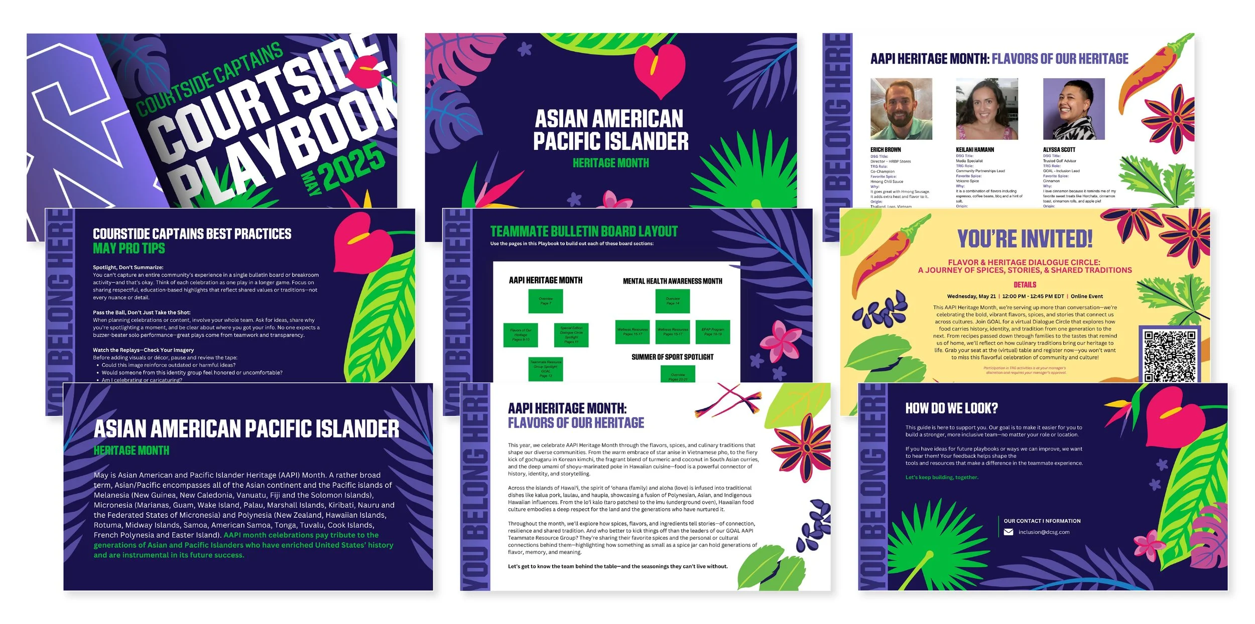
Courtside Playbooks
Monthly playbooks I design for DICK’S Sporting Goods, helping store leaders engage teams in meaningful, actionable DEI moments.


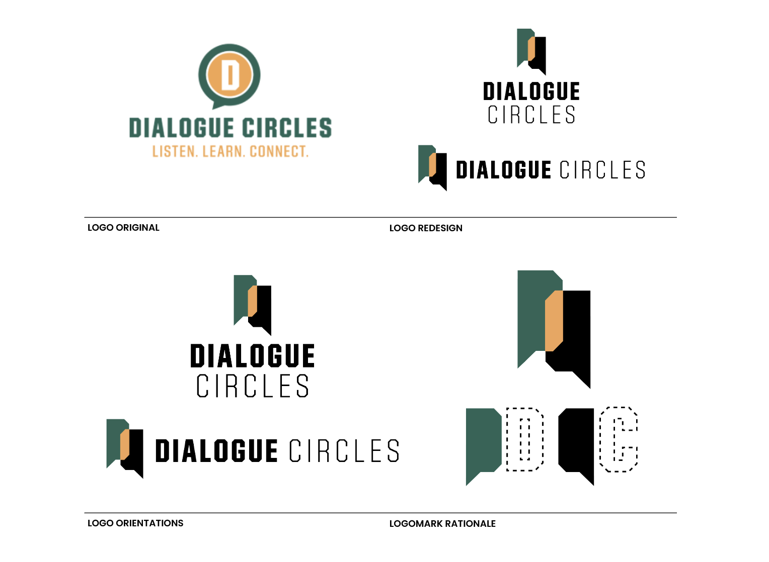
Dialogue Circles Logo Redesign
The two text bubbles in the logo are derived from the “D” and “C” in Dialogue Circles. Their overlap forms a subtle Venn diagram, representing the space where ideas meet and understanding is built. This visual captures the spirit of Dialogue Circles: fostering connection, reflection, and action through open conversation.
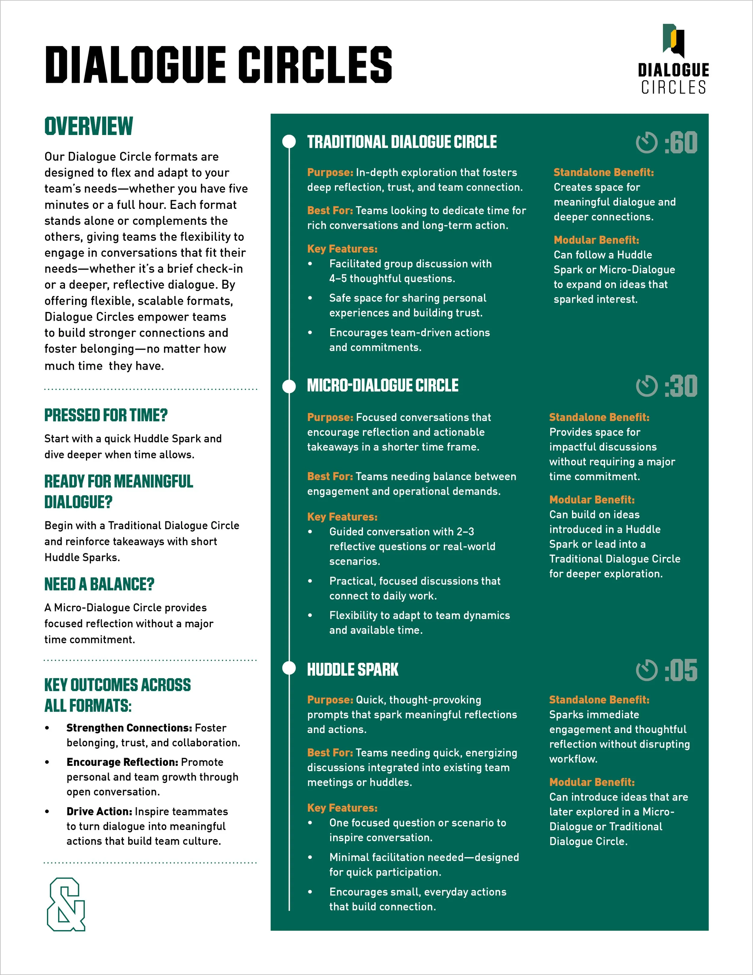
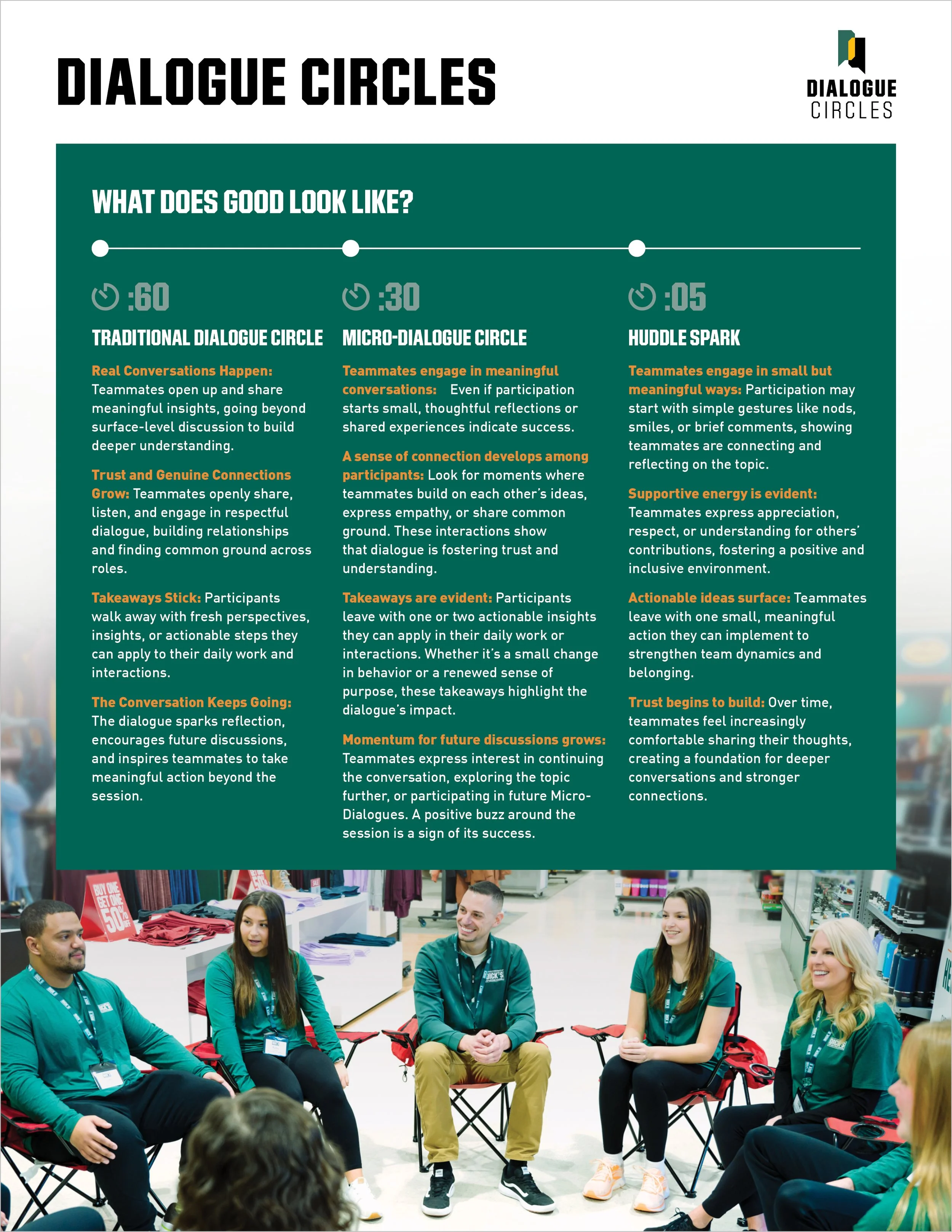
Dialogue Circles One-Sheet
An easy-to-share one-sheet showcasing the three Dialogue Circle types, designed for double-sided print or digital circulation.
Client: The West Side Tennis Club
Build the journey from initial communication through onboarding process with new pricing brochure and OFT email.

Pricing Brochure Redesign
Role: Custom illustration and graphic design


Previous Pricing Brochure
OFT Email
Role: Design/Formatting for E-Commerce Designer to apply HTML

Client: CenterCircle Creative
Design a new visual identity to accompany CenterCircle Creative’s brand revamp.
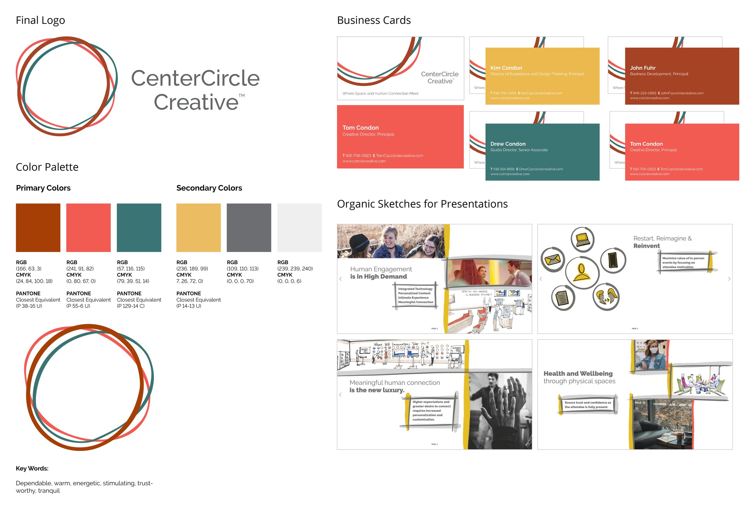
Brand Identity
Role: Art Direction + Graphic Design Execution

The visual system took form after several ideation sessions and color variations were addressed. Through color theory and diving deep into the intent of the brand, the final colors, logo lockup and remaining portions of the brand ecosystem were finalized.
Client: Simply Salad
A fresh alternative to fast food, Simply Salad was founded in LA to make healthy meals quick and affordable. To help grow their brand, I created illustrative animations for their website and mobile platforms, bringing their playful, health-focused identity to life.
Holiday Promos for Instagram
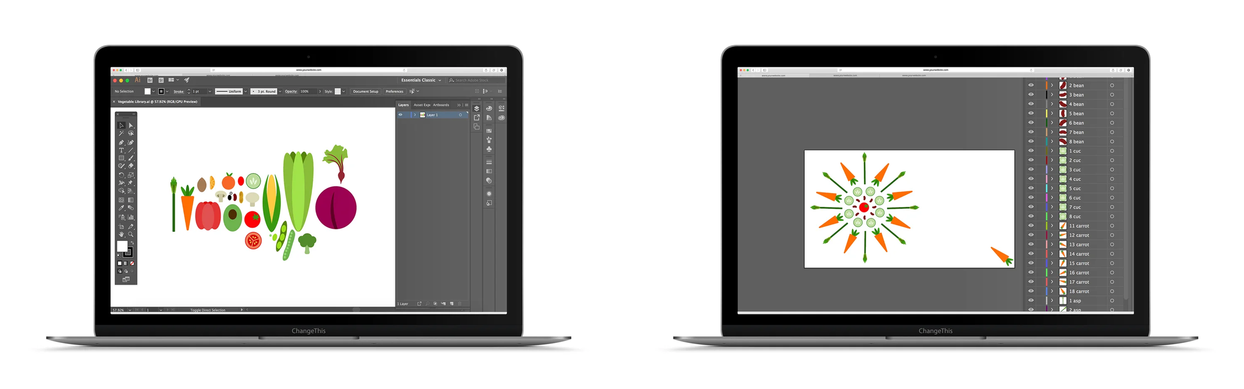
Social media is an ideal channel for quick, memorable brand reminders. These two holiday-themed graphics were designed to capture Simply Salad’s followers' attention with minimal effort. Both promos repurpose the same custom vegetable illustrations, highlighting the versatility of the assets I created.


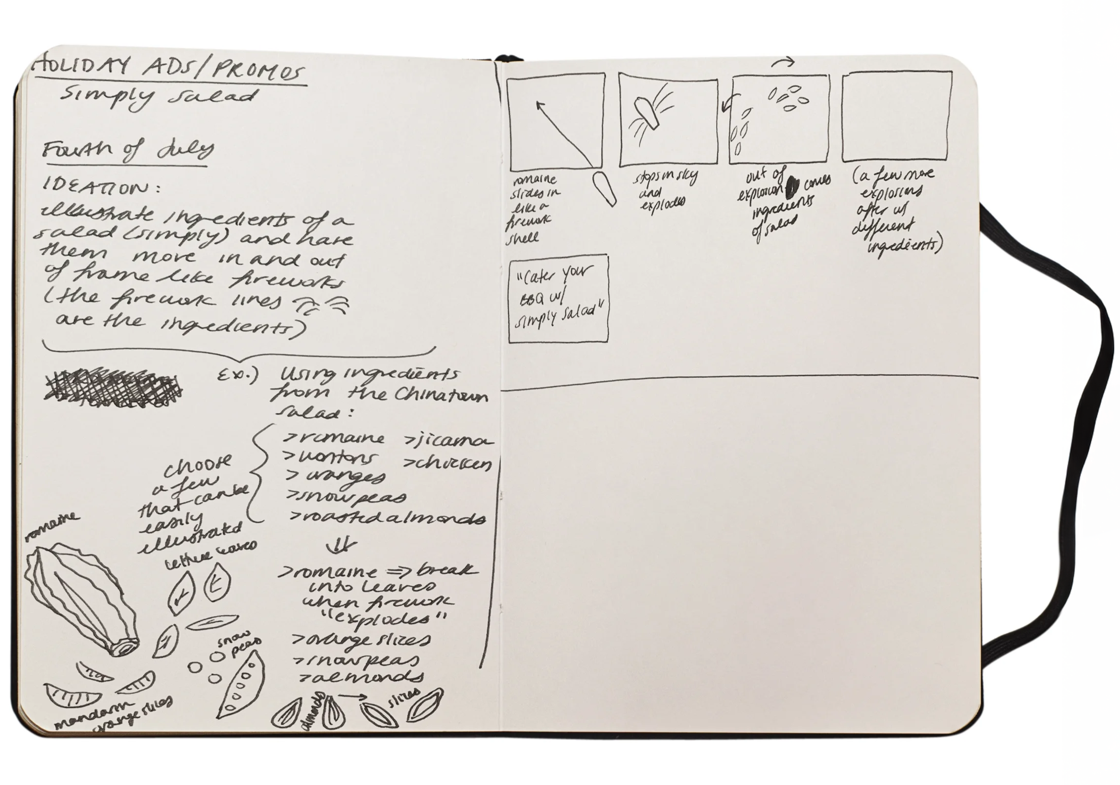
Process
As with any project, I begin by brainstorming and developing a strong concept. Once the idea is solidified, I move into sketching and storyboarding. After approval, I create the final assets in Illustrator, then prep the file by organizing layers for animation in After Effects.
Logo in Motion
I was tasked with animating a provided stacked logo for both web and mobile use. My role included ideation, organizing the file into animation-ready layers, and executing the final animation.

Error 404 Null State
I was responsible for designing and animating an Error 404 null state for both web and mobile platforms. My role included concept development, organizing the design file into layered assets, and bringing the animation to life.

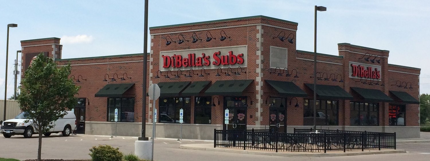
Client: DiBella's Subs
DiBella's Subs, the fast food restaurant chain based in Rochester, New York has been around since 1918 and has expanded substantially since. The family-owned operation has opened locations in six states and is continuing to establish new locations. As the business has grown, and years have passed, DiBella's Subs sought the help of a designer to update their in-store signage and packaging to reflect a more modern image.

In-Store Poster
Tasked with illustrating a new promotional sign for DiBella's Subs, I started by searching for a stock image of a little girl eating a cookie. In addition, I wanted to ensure that issues of diversity were addressed and that the DiBella's Subs product was present. After selecting an image, I worked in Adobe Illustrator creating a vector-based illustration that showcases the Grandma DiBella's Old Fashioned Chocolate Chip Cookie and the brand's main color palette.
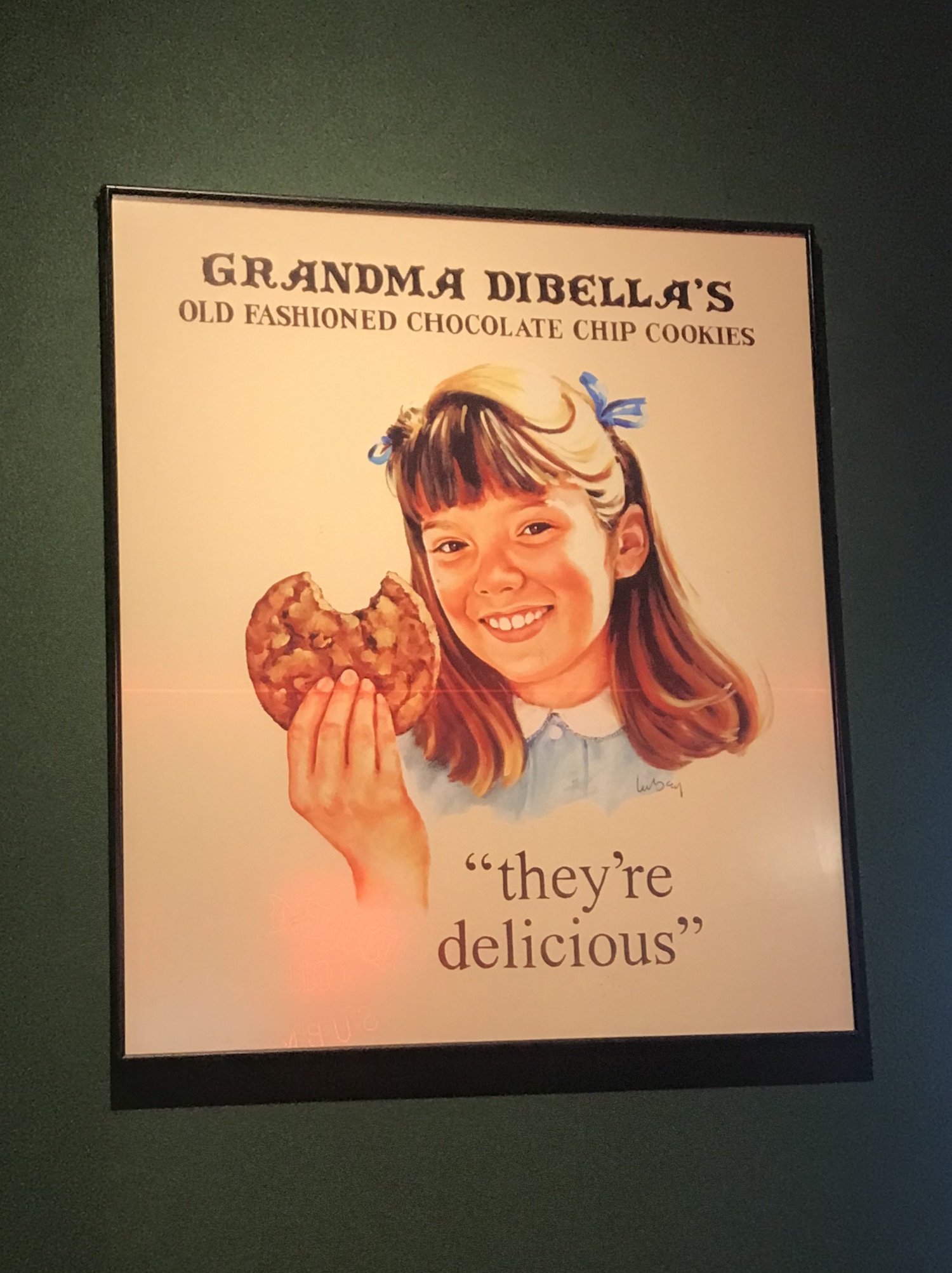
Previous Poster

Redesigned Poster
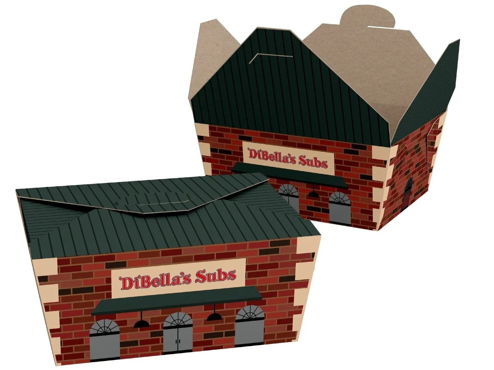
Kids Meal Packaging Design
One thing that really separates DiBella's Subs from other competitors is its kids meal option. However, despite this being a menu item, it is something that is not heavily advertised. The goal of this packaging design was to elevate the product's visual appeal in order to educate and encourage customers of this menu option.
The design was inspired by iconic look of the DiBella's Subs restaurants and incorporates the old school neon sign in side window of the box.
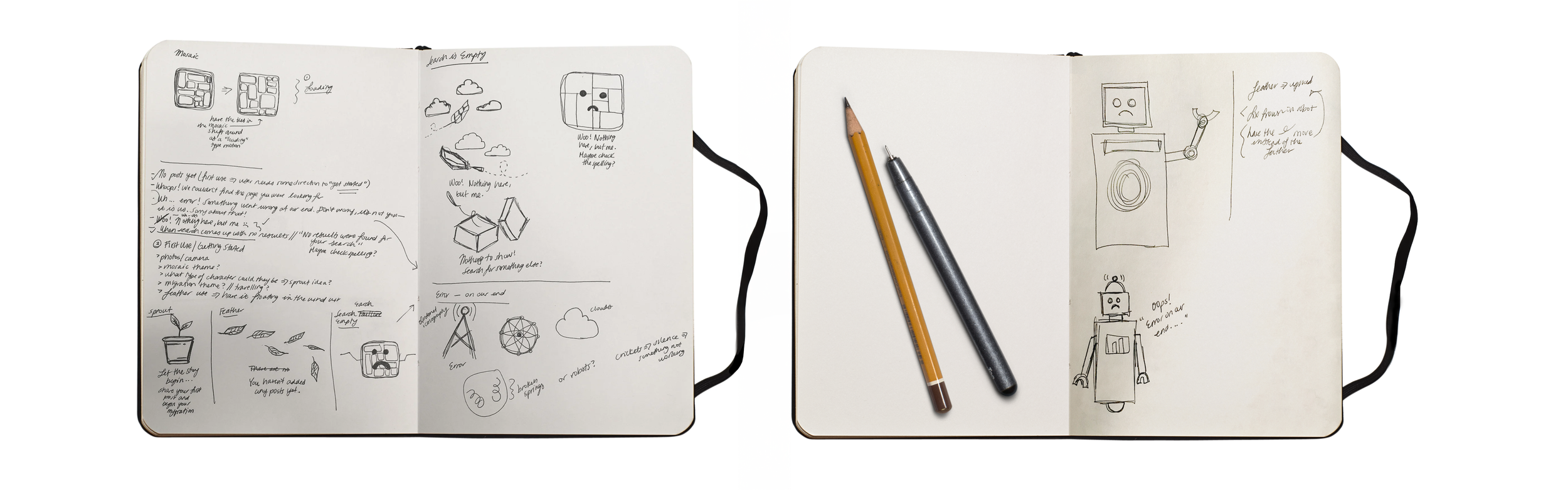
Client: Mygration (App)
As a Senior UI/UX Designer at the 2018 Pixels & Print Design Workshop, I had the privilege of collaborating with a team to launch Mygration—a platform empowering refugees to share their stories and preserve their photographs. Over the course of three days, we developed a fully functioning website and app, including four cohesive null states, which I illustrated and animated.


Client: Mr. Chicken
The family-owned and operated community staple, Mr. Chicken, has been serving southeast Michigan for over 50 years. As an homage to its loyal customer base, many of which dine-in on a weekly basis, the owner thought it would be fitting to offer a retro-inspired t-shirt to purchase.

T-shirt colors were inspired by the iconic Mr. Chicken sign stationed right outside the family-owned business in Dearborn Heights, MI
